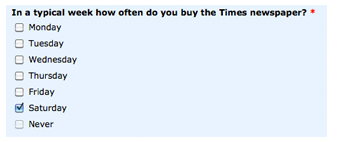
The Times recently launched a competition to win an iPhone 4S. You just had to fill in a form with about 7 or 8 questions and tell them some of your Times buying habits in order to enter. I think perhaps, that the construction of this form was a bit last minute.
 ‘Saturday’ isn’t really the answer to this question, and it’s therefore slightly confusing. It would have been better to ask people on what days do they buy the Times. At the bottom of the form you’re presented with the ‘Submit’ button and a ‘Reset’ button.
Only, really they’re in the wrong place and if you’re a fast typer and clicker you could easily click reset (as I very nearly did) erasing all of your work as most buttons in order to proceed, such as Continue or Next is nearly always on the bottom right. And this isn’t convention by accident. Just getting someone to run through this form properly would have probably fixed these issues.  I suppose, you can’t really expect people to take too much notice of semantics when they’re purely only entering to win something, but you may miss out on gathering details if they reset their form, and can’t find the energy to fill it out again. It’s really small details like this, and lack of attention to them could be causing you to lose huge customers or create dips in conversion rates, which is really the point. Additionally, there is likely to be a correlation between well written forms and trust as well. People are less likely to hand over their information if the form asking for it doesn’t ask them questions that make much sense.
 All of us have within us the tools required to reach our potential.
Leave a Reply